/** * The callback used to indicate a date has been selected or deselected */ publicinterfaceOnDateSelectedListener{
/** * Called when a user clicks on a day. * There is no logic to prevent multiple calls for the same date and state. * * @param widget the view associated with this listener * @param date the date that was selected or unselected * @param selected true if the day is now selected, false otherwise */ voidonDateSelected(@NonNull MaterialCalendarView widget, @NonNull CalendarDay date, boolean selected); }
/** * The callback used to indicate the user changes the displayed month */ publicinterfaceOnMonthChangedListener{
/** * Called upon change of the selected day * * @param widget the view associated with this listener * @param date the month picked, as the first day of the month */ voidonMonthChanged(MaterialCalendarView widget, CalendarDay date); }
getSelectedDate():获取被选中的日期。
1
2
3
4
5
6
7
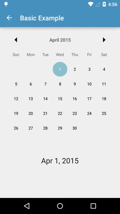
private String getSelectedDatesString(){ CalendarDay date = widget.getSelectedDate(); if (date == null) { return"No Selection"; } return FORMATTER.format(date.getDate()); }
/** * Decorate Day views with drawables and text manipulation */ publicinterfaceDayViewDecorator{
/** * Determine if a specific day should be decorated * * @param day {@linkplain CalendarDay} to possibly decorate * @return true if this decorator should be applied to the provided day */ booleanshouldDecorate(CalendarDay day);
/** * Set decoration options onto a facade to be applied to all relevant days * * @param view View to decorate */ voiddecorate(DayViewFacade view);
/* * Copyright (C) 2015 The Android Open Source Project * * Floating action buttons are used for a * special type of promoted action. * They are distinguished by a circled icon * floating above the UI and have special motion behaviors * related to morphing, launching, and the transferring anchor point. * * blah.. blah.. */ @CoordinatorLayout.DefaultBehavior(FloatingActionButton.Behavior.class) publicclassFloatingActionButtonextendsImageButton{ ...
privatebooleanupdateFabVisibility( CoordinatorLayout parent, AppBarLayout appBarLayout, FloatingActionButton child { if (a long condition){ // If the anchor's bottom is below the seam, // we'll animate our FAB out child.hide(); } else { // Else, we'll animate our FAB back in child.show(); } } }
float a1=getResources().getDimension(R.dimen.dp_01); int a2=getResources().getDimensionPixelOffset(R.dimen.dp_01); int a3=getResources().getDimensionPixelSize(R.dimen.dp_01); float b1=getResources().getDimension(R.dimen.px_01); int b2=getResources().getDimensionPixelOffset(R.dimen.px_01); int b3=getResources().getDimensionPixelSize(R.dimen.px_01);
float c1=getResources().getDimension(R.dimen.sp_01); int c2=getResources().getDimensionPixelOffset(R.dimen.sp_01); int c3=getResources().getDimensionPixelSize(R.dimen.sp_01);